Categories
Blogroll Business Captivate Flare Humor? Language Process Rants ROI Tools Training Uncategorized Water Cooler Stuff Writing

Why User-Centered Design Matters

When was the last time you used an application that was just impossible to comprehend?

Shaun Article 1


<!–more–>

Shaun Article 2


Or that you visited a web page that made it hard to find what you were looking for?

Shaun Article 3


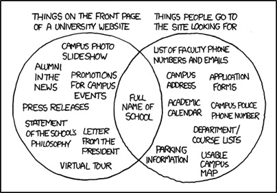
I’m guessing you don’t have to rack your brain too hard to come up with an example. In fact, if you’re reading this at work, you might very well have opened our newsletter just to take a break from the confusing enterprise software you’re stuck using for your job.

The Science Behind the Suck

During World War II, Army Air Force scientists noticed that changes in cockpit design often had disastrous effects on pilot performance. When the mental and physical capabilities of pilots did not align with the design of the aircraft, pilots were much more likely to make a mistake. Considering these “human factors” as part of the design turned out to be an important safety and performance issue. This insight led to a new science that linked human psychology to product design.

Fast forward to 1990s. Computer software starts to become mainstream. No longer the realm of the most technical users, human capabilities and product design started to clash again. Building on what the Human Factors researchers had learned, the science of usability engineering took off to meet the challenges of software design.

Some of the important human characteristics that must be considered include:

  • People have limited working memory capacities
  • Attention limits the ability of our minds to process only so many thoughts and inputs at once
  • Our eyes are drawn to salient features
  • We mentally group things in predictable ways
  • Our perceptions are colored by our experience and expectations

So how do you use this knowledge to make digital products that don’t give people fits? I’ll give you a hint: you’ll have to do a little more than add a line that “the application will be designed with usability in mind” to your requirements doc.

User-centered design is an approach to designing and developing software that results in applications and websites that are easier to use and better meet the needs of users.

What Is User-Centered Design

It starts by putting users at the forefront of design decision making. That’s what user-centered design is all about. Through research, observation, iterative design, and usability testing, we can understand the needs and behaviors of our users and use our expertise as designers to craft products which are useful, usable, and pleasurable to the users.

A typical user-centered design process would go something like this:

Shaun Article 4


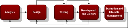
  1. Analysis – Identify the characteristics of the users, user goals, context of use, and business goals. Talk to actual users and business stakeholders.
  2. Design – Create mockups or lo-fi, low cost prototypes of the solution based on the information gathered in the analysis phase.
  3. Testing – Test your mockups or prototypes with actual users to determine what works and what needs to be improved. Iterate on the design and testing phases to improve the process and move closer to …
  4. Development and Delivery – Building as you iterate through the test and design phase, you’ll approach higher fidelity until you’re ready to complete the development and delivery of your project.
  5. Evaluation and Lifecycle Management – Evaluate the success of the project against the characteristics defined in step 1 by measuring the behavior of actual users. Continue to ensure the product is updated using user-centered principles throughout the lifecycle.

Noticing a theme?

Why Is That So Important?

In the realm of ecommerce, the consultants User Interface Engineering used user testing to discover a usability flaw that was costing a major retailer $300M in lost revenue (http://www.uie.com/articles/three_hund_million_button/). When designing products, Jakob Nielsen estimates that spending 10% of a project’s budget on usability doubles the quality metrics for the project (http://www.nngroup.com/articles/usability-101-introduction-to-usability/).

When designing intranets and enterprise applications for internal use, your users may not have somewhere else to turn. In those cases, you don’t have to worry about losing customers. But poorly designed applications can cause all sorts of problems.

  • Employees are less efficient at their jobs when the tools they need are hard to use.
  • Confusing interfaces may cause employees to make costly errors.
  • Users blame themselves when they have trouble using an application, so having to spend the day using a suite of poorly designed applications leads to unhappy workers and lowered employee morale.

But We Don’t Have Designers! How Can I Get Me Some Of That User-Centered Design?

While you may not have designers, someone does design every application. It may be a business analyst or product manager doing mockups in Visio or it might be the developer turning user stories directly into front-end code. Inadvertent design is still design.

You don’t have to bring in an expensive agency or hire a team of User Experience Designers when you’re just starting out. The best way to improve the user experience of your products is simply to watch your users use your product.

User Interface Engineering has a list of excellent ways to start your user research (http://www.uie.com/articles/starting_user_research/).

Further Reading

If you’re interested in learning more, I suggest starting with the following books:

  • Don’t Make Me Think by Steve Krug – The classic introduction to designing websites and applications for usability. Quick and easy to read, it’s a must read for anybody involved in product work.
  • The Design of Everyday Things by Donald Norman – Norman is a pre-eminent cognitive psychologist and designer. Norman goes more in depth into the psychology of design than Krug, but this book is still quite accessible.
Categories
Blogroll Business Captivate Language Marketing Process Rants Uncategorized Useful Links Water Cooler Stuff Writing

Agile Development and Technical Writing

For additional information regarding Waterfall/Agile development and how it impacts technical writing, please refer to previous blog posts written by Eric Sedor and Shaun Kelly.

Moving a product out the door to capitalize on market demand is a necessity – it’s simple economics! Consumers demand constant product improvements. This “out with the old, in with the new” mentality has led many successful companies to switch from Waterfall development  to Agile. What does this mean exactly? For the uninitiated, use this simple analogy. Waterfall development can be compared to a marathon. All software features are built in one long process and then errors are fixed. Agile development is more like a series of sprints. Software is released in a series of small iterations. Each release includes a few added features, and errors are corrected along the way rather than at the end. As you can imagine, the switch to Agile development completely shatters the status quo and roles of people associated with the development teams. This led us to wonder: Specifically, how does the switch to Agile impact the role of technical writers?

Categories
Blogroll Business Captivate Flare Humor? Language Marketing Networking Rants Uncategorized Water Cooler Stuff Writing

Corporate Speak: Between Sweet Spot and Wheel House

These days, business speak surrounds us. It doesn’t discriminate against company size or position status. College interns and CEOs alike find themselves dropping buzz words in conversation. But to what end? When is enough, enough? The next time you want to move forward, deliver, or buy-in by all means go for it. But don’t expect people to know what you’re talking about. The more time your employees spend guessing the meaning behind your jargon, the less productive they are. Ben Franklin sums it up best:  “Time is money.”

Categories
Captivate Language Process Rants Uncategorized Writing

Why is Consistency Important?

It’s not like technical writing isn’t already incredibly boring, so why does it have to be consistent? Such is the typical complaint about what we at Shoap do to earn a living. So how important is consistency?

While we sometimes fantasize about people grabbing one of our documents and cozying up to the fire to spend some quiet hours learning how to use a new piece of hardware or software, the reality is starkly different. As they used to say about Ivory soap, 99.44% of the time the only reason people crack a user guide or click on online help is because they’re stuck: they can’t figure out how to do something that they need to do – and need to do immediately. 

Consistency means you can find information quickly and understand that information when you encounter problems. Let’s see how.

Categories
Business Captivate E-mail Language Rants Tools Uncategorized Writing

What’s Wrong with the Passive Voice?

Why do people use the passive voice? Engineers, scholars and business people alike use the passive voice on a daily basis – probably without even realizing it. So then, why is passive voice frowned upon and what exactly is it?

Simply put, passive voice is a style of writing that makes the object of the sentence the subject of the sentence. Sentences written in passive voice are structured so that the noun who performs the action is not the subject. Confused? Consider this illustration.

Sentence 1: I made a mistake (Active)
Sentence 2: Mistakes were made. (Passive)

Categories
Captivate Computer Languages Process Visual Aids

Interactivity Brings New Life to Traditional e-Learning

The Work Management Process is an initiative of one of our clients to standardize the process of work identification, planning, and completion at power plants the Company owns and operates. This process aims to transition work activities at power plants from a reactive to a planned mode, thereby improving asset reliability and lowering costs.

The purpose of this training is to present an overview of the Work Management Process either as a refresher for existing employees or as an introduction for new employees.

The training is broken down into six lessons, each of which correspond to a particular step within the Work Management “Wheel.”  Unlike a training course delivered via a learning management system, this training is completely open-ended so learners are free to explore and learn at their own pace.

Although this training is open-ended, some managers wanted their employees’ progress  to be tracked to test their mastery of the content.  Learners can directly link to a short quiz stored within an online learning management system from the Work Management Process Training site.

Goals and Objectives

The original Work Management Process Training existed as a 180-page document that learners had to read.  Once our Technical Communications project team got our hands on that, we all recognized that we had an opportunity to create a unique eLearning experience from this training.

The primary goal of the training site is to create an interactive, online resource that employees can visit to learn about the Work Management Process.  Using a simple design, contextual links and actions, drill-down exploration of content, and leveraging interactive learning experiences, our training site easily stands out as a technology-based learning site unlike any other training initiatives we have created in the past.

Categories
Captivate

More Buttons!

Recently, I was working on a new Captivate project when I noticed that one of my go-to buttons did not show up in the drop-down menu with button styles.  Most of the projects where I used that particular style were created in Captivate v.2, so I assumed that the button styles were unique to that version of the application.

Wrong.

Categories
Captivate

Captivate -ing Discoveries

error1.jpgIf you’ve just started using Captivate, the best advice I can give is the kind that should be printed in big, friendly letters on the front of every technology-related reference guide or manual… DON’T PANIC.  While there are a million and one reasons to use our favorite demo/presentation/simulation software, there are a few issues that you are inevitably going to have to deal with.  In the past I’ve written about consistent, reproducible errors that I’ve had to work around, but once in a while I run into something entirely new and unpredictable.

error2.jpg

After recording a demo today, I went back into the project to edit the auto-generated captions.  I checked the “Apply To All” options and then changed the caption style from Adobe Blue to Haloblue.  The default text size for both caption styles is 12 pts, but when I clicked OK, it changed all caption text to the Haloblue style… at 16 pts.

I undid the change, re-tried it on the same caption, and saw the same behavior.  After closing and re-opening Captivate, I could no longer replicate the issue.

So don’t panic.  Always reboot first.

Categories
Captivate

Careful With That Captivate Update!

Howdy folks! Hope all has been well since our last exciting installment in our ongoing Captivate entomology series.

Since my last post back in May, I’ve had the mixed experience of upgrading to the latest version of my *favorite* software package in the world. I would be ready to give our faithful readers a full run-down of the new features and enhancements in v.3, if it weren’t for the fact that I’ve been tied up troubleshooting what I considered to be a show-stopping issue with the new version: an apparent inability to capture full-motion recordings.

Categories
Captivate

Bride Of The Captivate Bug

Don’t have much time to spend on this post today but I thought I would put something up regarding some Captivate bugs that I’ve experienced recently, and how I’ve worked either with them or around them:

Click boxes that can’t do simple math

Captivate click boxes give you the ability to specify an action to perform when a user clicks outside of the box a certain number of times. While building a quiz-type activity, I thought this would be a good way to invoke an error message whenever the student clicked on not-the-right-answer enough times (I set it to 2 times). The error message would then take the student back to the start of the activity to try again. Well, it worked, except that after getting a wrong answer on the first slide and cycling back through to the same slide, the click box reacted to clicking on not-the-right-answer a single time (instead of twice, like I specified in the click box’s properties). I haven’t figured out how to work around this – if you did, tell me about it in the comments!